Introduction
Accessible Beige (SW 7036) is one of those colors that seems to effortlessly fit into almost any space. Part of Sherwin-Williams’ popular neutral palette, this warm, light-to-mid-tone beige has subtle gray undertones, giving it a “greige” quality that makes it both cozy and modern. Its balanced light reflectance value (LRV 58) allows it to create warmth without making rooms feel heavy, making it a favorite for interiors and exteriors alike.
Whether you’re updating a kitchen, refreshing living room walls, or choosing a siding color for your home’s exterior, Accessible Beige provides a versatile backdrop that adapts to many styles. Its understated elegance and ability to blend with other colors make it a reliable choice for homeowners and designers who want a neutral that never feels flat or boring.
Accessible Beige and Its Unique Undertones
What sets Accessible Beige apart is its subtle interplay of tones. At first glance, it appears as a soft beige, but a closer look reveals a gentle gray base with hints of orange. This combination gives the color depth, making it more dynamic than standard beige. One of the most intriguing aspects of Accessible Beige is how it reacts to light. Depending on the room’s lighting conditions, it can take on slight greenish or pinkish undertones.
This chameleon-like quality allows it to harmonize with many other shades, giving each space a unique personality. Its ability to adapt is why designers often describe Accessible Beige as a flexible, non-committal neutral — it doesn’t overpower a room, yet it provides enough warmth and character to create a welcoming environment.
Best Lighting Conditions for Accessible Beige
Lighting plays a crucial role in how Accessible Beige appears in any space. Rooms that receive plenty of natural light, especially those facing east or west, tend to show its warm, beige side most clearly, while also highlighting its soft gray undertones. In spaces with less natural light, like north-facing rooms or heavily shaded interiors, the color may appear a bit darker or muted.
To counter this, combining Accessible Beige with good artificial lighting can maintain its brightness and warmth. Using warm LED lights or layering lighting through lamps and ceiling fixtures can help bring out its natural warmth, while cooler lighting can emphasize the gray undertones for a more modern feel. Paying attention to light sources ensures that Accessible Beige remains versatile and flattering throughout the day.
Comparing Accessible Beige to Similar Colors
Accessible Beige is part of a larger family of neutral shades, and understanding its subtle differences from similar colors can help in making the right choice. Balanced Beige (SW 7038) is a darker, richer alternative that provides more contrast in a room. Agreeable Gray (SW 7029), on the other hand, leans more toward gray, making it a cooler option that can appear crisper in well-lit spaces.
Shiitake (SW 9173) is very close to Accessible Beige but offers slightly more depth, which can make a room feel cozier. Choosing between these options depends on the mood you want to create, the lighting in the space, and the colors you plan to pair with the walls. Accessible Beige sits perfectly in the middle, offering enough warmth to feel inviting while maintaining neutrality to support a wide range of design choices.
Complementary Colors and Pairing Ideas
Accessible Beige is incredibly versatile when it comes to pairing with other colors. For trim and moldings, crisp whites such as High Reflective White (SW 7757) offer a clean, classic contrast that highlights architectural details. Muted blues and greens complement its warm undertones, creating a balanced, calming effect. Darker shades like charcoal or rich navy can be used to add drama and depth to a room without overwhelming it.
When it comes to finishes, Accessible Beige pairs beautifully with both light and dark wood tones, as well as metallic accents in gold, bronze, or brushed nickel. These combinations allow the color to feel at home in traditional, transitional, and modern interiors alike, demonstrating its flexibility in design.
Ideal Applications for Accessible Beige
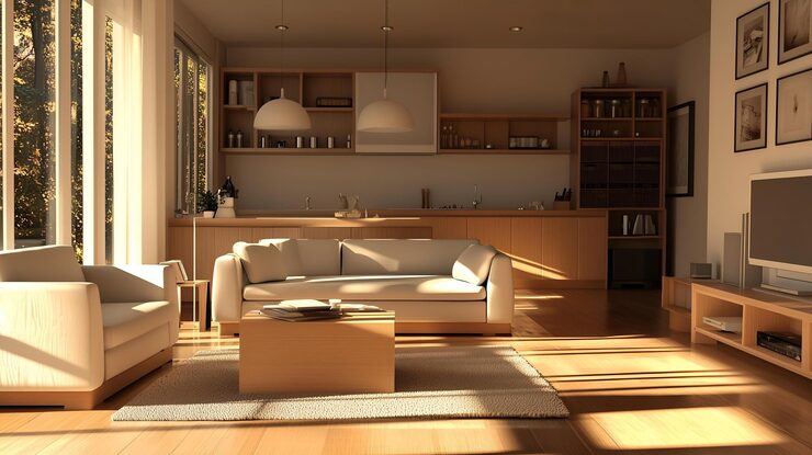
Accessible Beige is suited for a variety of applications, both inside and outside the home. In living rooms, it provides a warm, neutral backdrop that works well with furniture, artwork, and textiles. Kitchens benefit from its light and airy feel, especially when used on cabinetry or walls, helping to create a welcoming space that feels larger and more open.
Open-concept spaces, where rooms flow into one another, particularly benefit from its adaptability, as it unifies different areas while complementing a wide range of décor. Beyond interiors, Accessible Beige also shines on exterior siding, blending naturally with landscaping and architectural features. Its versatile nature makes it suitable for contemporary, farmhouse, and classic home styles, ensuring that it adapts seamlessly to almost any design vision.
Tips for Getting the Most Out of Accessible Beige
To maximize the impact of Accessible Beige, consider how it interacts with textures, patterns, and materials. Layering soft fabrics, natural woods, and textured surfaces adds dimension to spaces painted in this neutral shade. Pairing it with accent colors — whether through furniture, rugs, or artwork — can enhance its warmth and versatility.
When using Accessible Beige, it’s important to avoid common pitfalls, such as placing it in a dimly lit room without adequate artificial lighting, or combining it with colors that clash with its subtle undertones. Thoughtful planning ensures that the color highlights your space’s best features while maintaining its elegant, adaptable character.
Conclusion
Accessible Beige (SW 7036) has earned its place as a reliable, versatile neutral because of its warmth, adaptability, and subtle gray undertones. Whether you’re working with natural or artificial light, pairing it with complementary colors, or applying it across various interiors and exteriors, this shade offers a timeless appeal that few neutrals can match.
Experimenting with lighting, textures, and accent colors allows it to transform and adapt to every space, making it a go-to choice for homeowners and designers who want a color that balances comfort, style, and flexibility. Ultimately, Accessible Beige proves that a neutral doesn’t have to be boring — it can be the foundation for spaces that feel both modern and inviting.
FAQs
Is Accessible Beige warm or cool?
Accessible Beige is a warm neutral with subtle gray undertones, making it a “greige” that can appear slightly cooler or warmer depending on light.
What rooms work best for Accessible Beige?
It works in living rooms, kitchens, bedrooms, open-concept spaces, and even exteriors. East- or west-facing rooms bring out its warmth best.
What colors pair well with Accessible Beige?
Whites for trim, muted blues and greens, rich dark shades, natural wood tones, and metallic accents all complement it beautifully.
Can Accessible Beige appear differently in low light?
Yes, in north-facing or dimly lit rooms, it may look darker or muted. Using layered lighting helps maintain its warmth and versatility.
How is Accessible Beige different from Agreeable Gray?
Agreeable Gray is cooler and grayer, while Accessible Beige leans warmer with more beige tones, making it slightly cozier and more adaptable.
My name is Mustafa, and I have been blogging for over 5 years. I am passionate about sharing complete, accurate, and helpful information with my readers. Along with managing content on The Matcha Read, I also contribute blog posts to premium websites. My goal is to provide valuable insights in a clear and easy-to-understand way, so every reader walks away with useful knowledge.